
My Top Tips to Level up Your Squarespace Fluid Engine Mobile Design
As a designer who specializes in Squarespace, I am obsessed with Squarespace’s Fluid Engine.
Fluid Engine is a new builder that allows you to design your mobile design independently from desktop view.
This is a big advantage for both designers and clients as there are several things that we can do for mobile that was not possible in the Classic Editor without extensive coding.
While it can feel like double the work of having to design your website twice, the benefits far outweigh the inconveniences. If it feels a bit tedious having to go in and out of your mobile editor as you’re designing, stay tuned for some handy tips on how to speed up your process as you design.
Here are my tips and best practices to help you take your mobile design to the next level using Squarespace's Fluid Engine.
Ready? Let’s get started! :)
Understanding mobile design with Fluid Engine
Fluid Engine uses a grid layout where you can adjust the spacing between rows and columns inside the grid. The spacing or Gap will apply to both the desktop and mobile design. For instance, in this example, you can see a spacing of ‘11’ applied to the horizontal and vertical spacing.
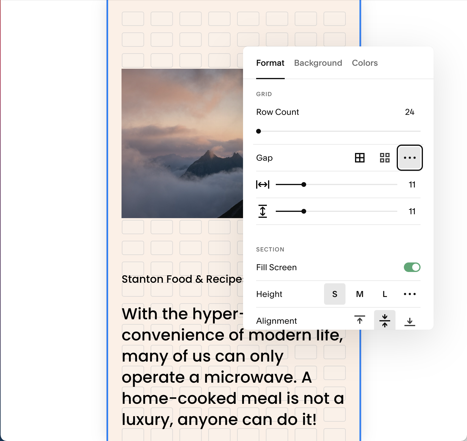
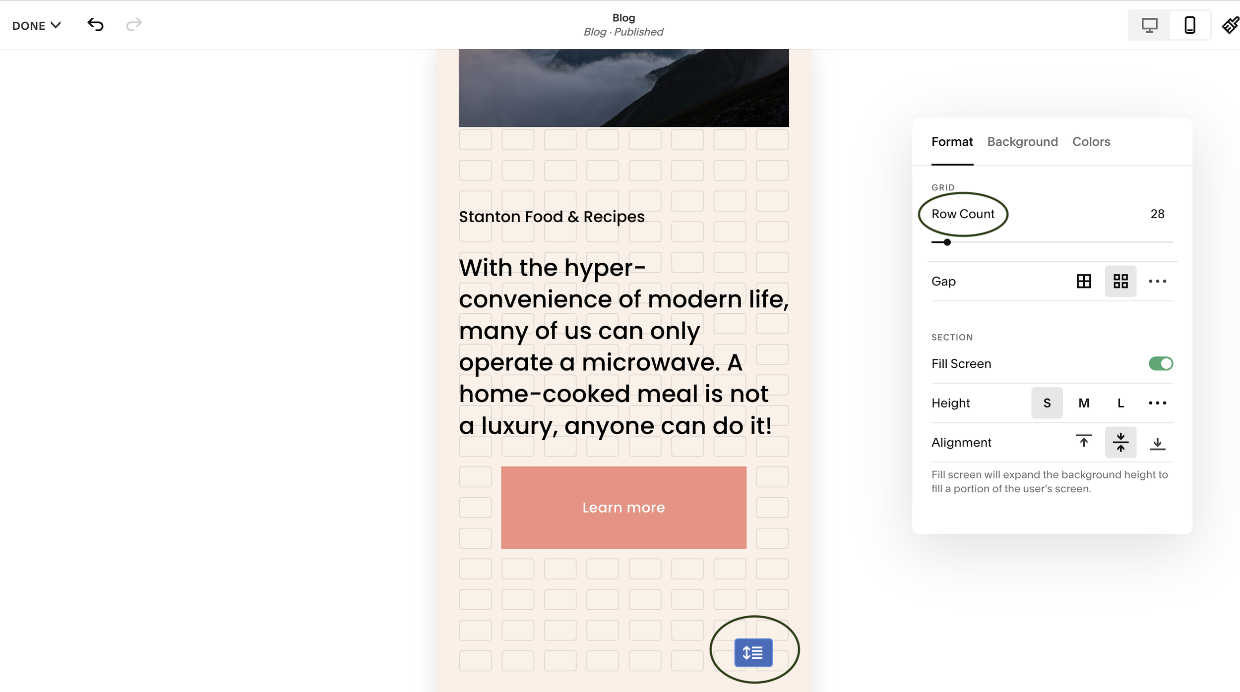
When you switch to mobile design, Squarespace automatically adjusts to 8 columns across. While you can’t adjust the number of columns across (only the spacing!) you can add extra rows to your mobile section to give yourself more space to design.
To add extra rows slide the Row Count to the right or move the double-sided blue arrow up or down. This allows you to add extra space without the need for spacer blocks. Remember those?! ;)
How to edit your mobile design using Squarespace Fluid Engine
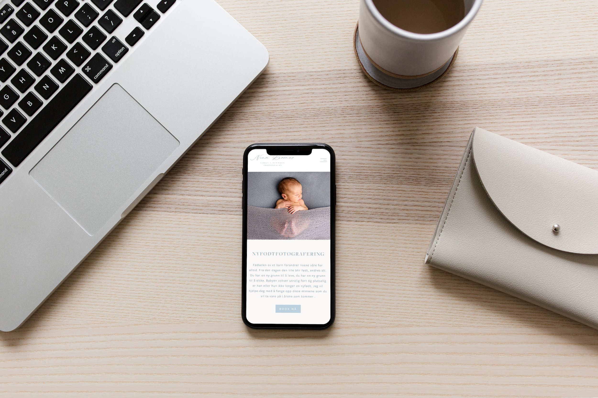
If you’re on a new Squarespace plan, your website will already be using Fluid Engine so there’s no need to upgrade. Simply click on the mobile icon to bring up the mobile view while you are in the back end of your website and click edit.
To bring up the grid layout, tap on ‘G’ on your keyboard. You’ll see the rows appear in the background behind your text and images.
You can move the blocks around and design a layout independent of the desktop. Some cool things you can do include:
Placing blocks side by side. I.e two image blocks side by side
Overlapping text and image blocks
Extend images edge to edge for a full-width layout
Extend the scrolling block edge to edge - I love this one!
Adjust spacing inside the container and around the block
Adjust the size of image blocks
Tips for text and image alignment
Another great feature of Squarespace Fluid Engine is that you can align text and image blocks independently on mobile and desktop views. For instance, if you have a text block that is aligned to the top on desktop, you can align the same image to the centre on the mobile. Equally, with image blocks, you can choose your horizontal and vertical alignment independently of desktop and mobile.
Simply click on the block you’re looking to align and using the blocks toolbar choose from the corresponding alignment icons.
Important note: At the moment button blocks cannot be aligned independently between desktop and mobile. Hopefully, there’ll be a fix for this soon! For now, a workaround is to use the ‘Fill’ option for your button block and align as needed.
Top tips for editing mobile design with Fluid Engine
Keep it simple
The beauty of mobile design is in its simplicity. While it can be tempting to let your inner designer diva do all the talking, sometimes a simple layout where each block is stacked is the best option.
Aim to keep the user experience consistent throughout desktop and mobile. Squarespace will add blocks to mobile in the order that they are added on desktop. Sometimes moving blocks into the correct order is all you need to do to create a user-friendly experience. Other times you may need to do a bit more repositioning.
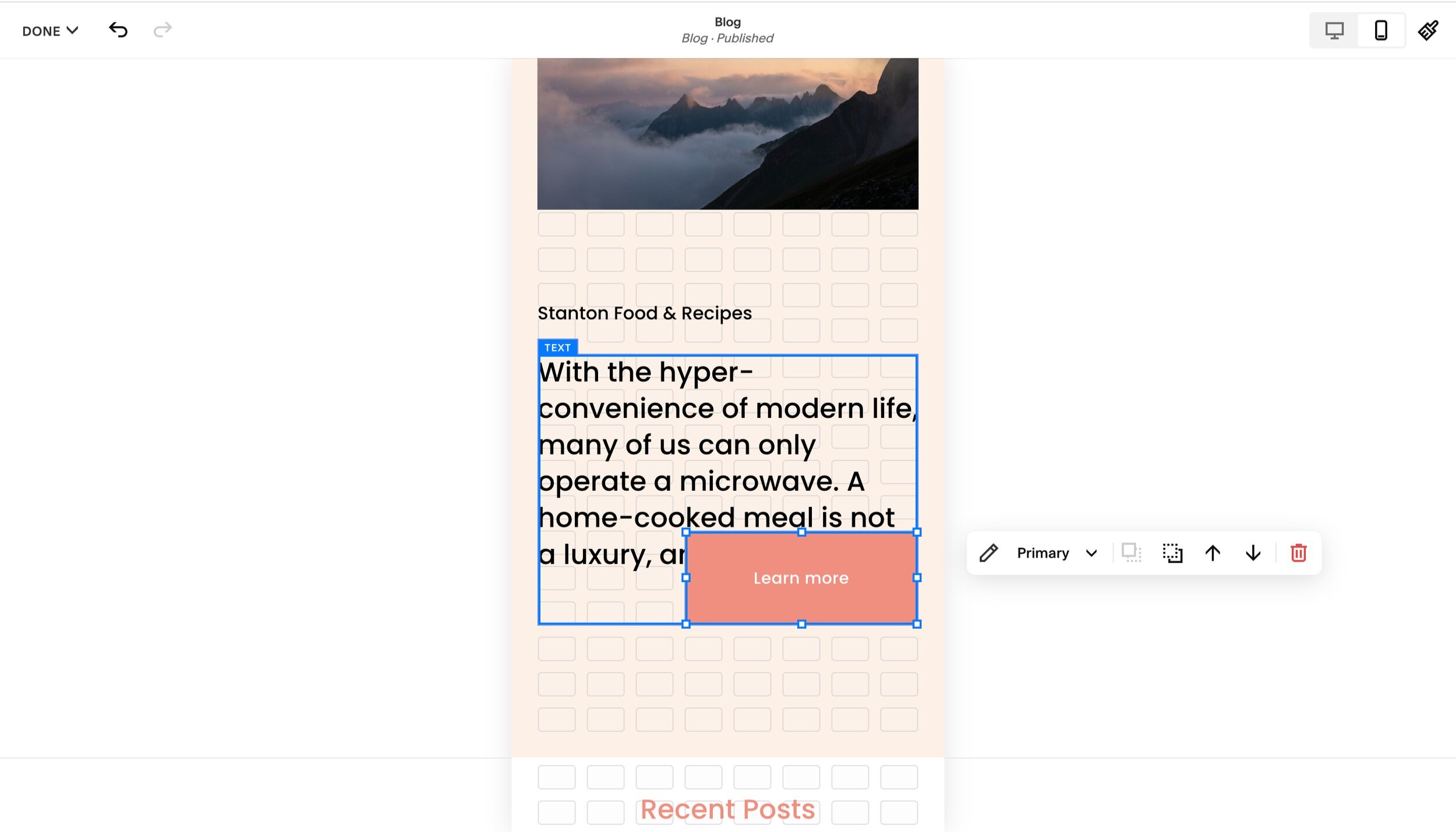
Overlapping blocks
With Fluid Engine, we now can overlap blocks in mobile design and create some quirky layouts. Yay!
Keep in mind that it’s best to only overlap where it makes sense or it keeps the design consistent. For instance, if you’re overlapping an image and text block that makes the text hard to read, it could be a better option to stack the blocks instead.
Where possible avoid overlapping text and button blocks as you may find that some of the text is hidden behind the button on certain screen sizes.
❌ How not to design your mobile site
In this scenario, the button block is inside the container for the text block. A better option would be to move the button block so that it is below the container of the text block.
It can be easy to miss this when designing on mobile devices, therefore it’s a good idea to check the spacing and placement of each block before you launch your website.
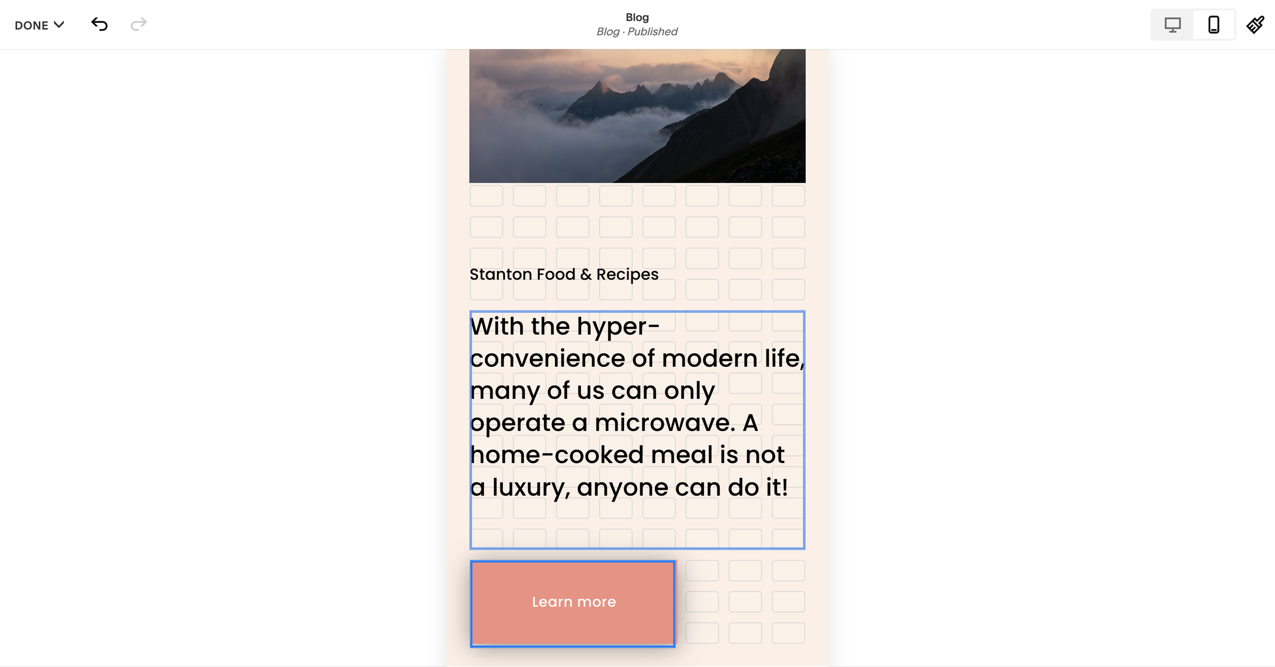
✔️Place the button block outside of the container of the text block
Remove excess space inside a block
When you switch from desktop to mobile view using Fluid Engine, you’ll likely find that some of your blocks have extra space inside the container that’s unnecessary for the design.
As you’re going through the design, clear up the space as needed. Do this by reducing the size of the containers or the row count.
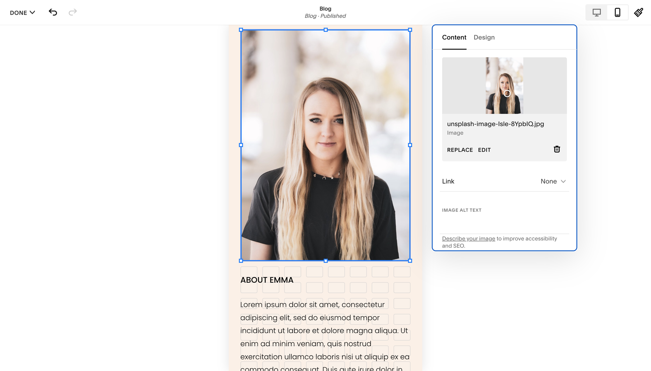
Use Fill and Fit images wisely
Fill and Fit image containers are a great addition to Squarespace’s updates. The Fit setting will resize the image so that the length and width fit within the bounds of the container without cropping the image.
The Fill setting will resize the image so that it fits inside the entire container. Depending on the size of the container, it can look like a close-up of the image.
When designing for mobile view, you may need to play around with whether Fill or Fit is the best option if your images. If your images contain people, you may find the image crops in an unflattering way on the Fill setting. You can adjust the image size on mobile to fix this, adjust the image focal point or use the Fit setting instead.

❌ Avoid!
✔️Better!
Just a note to consider as you’re designing your website. Be sure to double-check your images across devices!
Design desktop first and then mobile
When designing in Fluid Engine, you cannot add blocks to the mobile layout. To speed up the process of designing and prevent decision fatigue, I find that it’s better to design first for desktop and then translate the design over to mobile.
There’s also no need to reinvent the wheel. Sometimes tweaking the design so that it flows in mobile is all you need to do!
Final thoughts on designing for mobile using Fluid Engine
While editing on mobile can have its quirks, for the most part, you have the flexibility to design your website exactly the way you want. Be sure to double-check the layout on a mobile device before you go live and iron out any remaining kinks.
Also, keep in mind that certain sections such as Gallery and List sections still conform to the default stacking and this cannot be changed. Otherwise, you’re good to go! :)