Building a Responsive Concept Website for a hotel to Demonstrate UX/UI and Frontend Skills
A collaborative project showcasing web development, UX/UI, and responsive design, selected as the winning project of the Code First Girls Web Development Kickstarter.
Role: Web Designer & Frontend Developer
Platform: Bootstrap & GitHub
Goals:
Build a responsive design using the Bootstrap framework
Demonstrate teamwork and collaboration
Present our project to the group

PROJECT OVERVIEW
As part of the Code First Girls Web Development Kickstarter, I collaborated in a team to design and build a concept website for a Scottish castle. The project combined creativity, design, and development skills.
The Journey
Challenge
The brief required us to design wireframes in Figma, code at least two working HTML pages, apply an external CSS stylesheet, and include interactivity and mobile responsiveness.
Approach
Working collaboratively, we used:
Figma for wireframing and layout planning.
Slack for communication and coordination.
VS Code and CodePen for developing.
Bootstrap for responsive design and layout consistency.
GitHub to share individual contributions.
My contribution included designing and coding the homepage, about page, and navigation, ensuring smooth usability and a cohesive design. I implemented hover effects, clickable interactions, and structured class/ID naming for maintainable code.
Outcome
Our website was chosen as the winning project for the course, recognised for its clean design, strong technical execution, and responsiveness.
After the course, I continued to develop the project, adding the rest of the pages and features such as:
Sticky sections
Accordions and overlays
Contact form
Embedded map and video
Flexible grids, containers, and tables
You can view the completed project here.
The PROCESS
-
Research
Collaborated with the team to define the website’s objectives, target audience, and desired user experience.
-
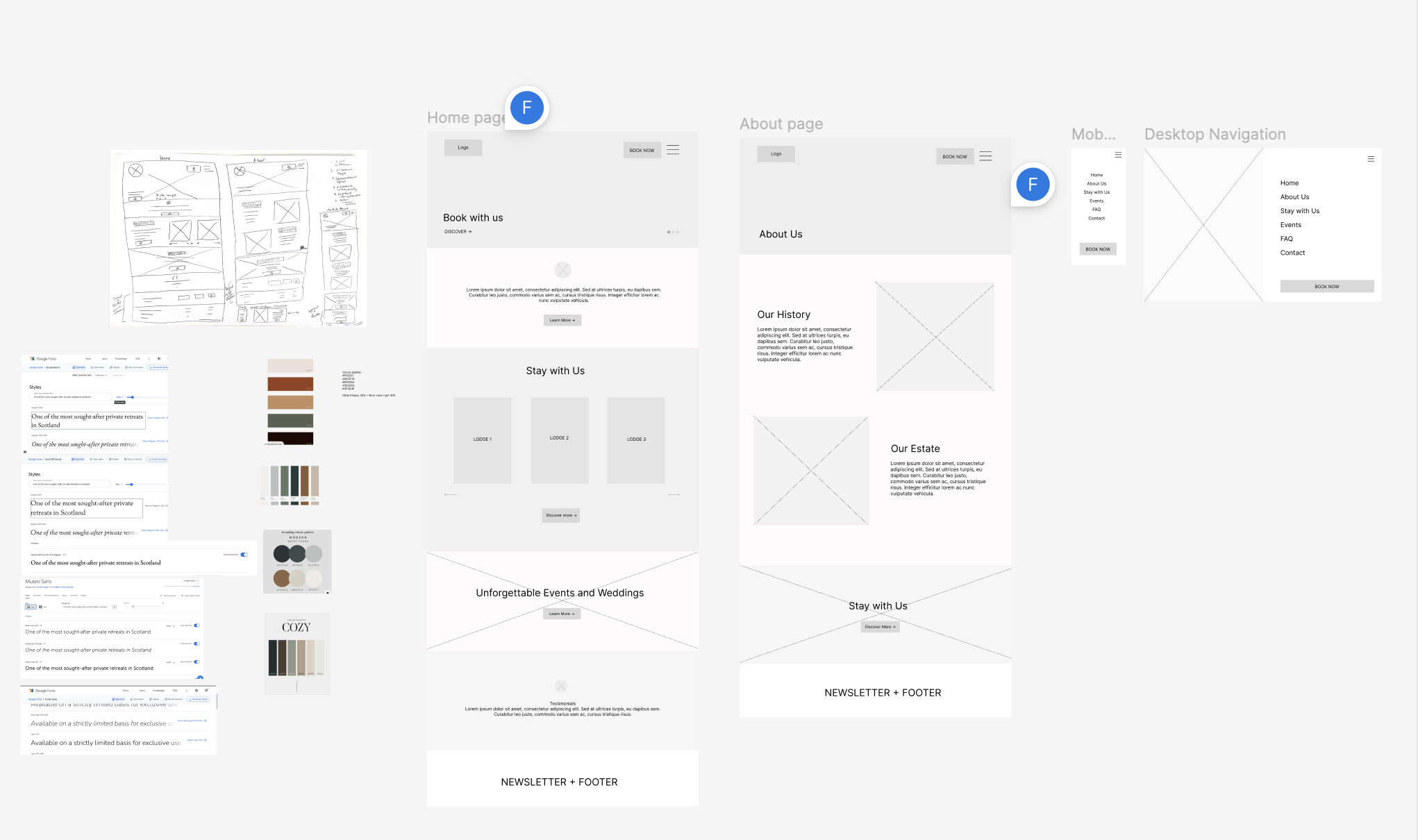
Wireframing & Mockups
Created low-fidelity Figma wireframes to plan layout and user flow. Curated colour palette and typography to reflect a premium, cohesive aesthetic.
-
Design and Development
Designed and built the website individually using VS Code, focusing on responsive design and incorporating insights from team discussions to align with the project vision.
-
Testing
Conducted testing across devices and browsers to ensure functionality, responsiveness, and a consistent user experience.
-
Group Presentation
Presented our individual pages to the cohort, demonstrating design decisions, functionality, and overall vision.
-
Github
Uploaded code to GitHub to share work with the team and document the project.
The Solution
Home Page

ABOUT page

Fill out the contact form and I’ll be in touch to organise our initial consultation call.